TL;DR
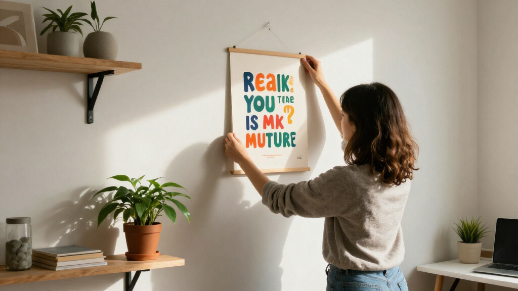
Motivational quote wall art pairs encouraging words with visual design, but its impact depends on choosing a message that feels relevant and a layout you can read from across the room. Measure your wall, check the print details, and treat the quote as a reminder that supports your habits rather than a promise of results.
A quote can look bold on your phone and vanish completely above your desk. That gap between screen preview and real room is why choosing motivational quote wall art takes more than picking a phrase you like.

Get the little things that make your day delivered free with Prime
- Fast, free delivery on millions of items
- Prime Video, Amazon Music and more included
- Member-only deals all year
The right piece brings together words you believe, a design you can read, and a size that suits the wall. It might be a framed print in a quiet home office, a bright poster near the treadmill, or a digital design you print yourself. Each option has different costs and practical details.
In this guide, you’ll learn how to choose wording, match the art to your room, place and size it well, and check materials and quote attribution. Think of the piece as a visible prompt: useful when it fits your life, but never a guarantee that a hard day will suddenly feel easy.
Choose wording that sounds believable and connects to a goal or value you care about.
Check type size, contrast, line spacing, and reading distance before buying.
Measure the wall and nearby furniture; test the proposed size with paper before hanging.
For digital downloads, check file quality, aspect ratios, printing costs, and framing needs.
Verify quote attribution and rights before publishing or selling a design.
Choose words that sound like you, not a greeting card
Motivational quote wall art feels most personal when its wording connects to your goals, values, or circumstances. A short phrase can catch your eye each day, but it needs to sound believable to you; a grand promise that feels false may become background noise. Relevant wording gives the design a reason to stay on your wall.
Imagine you’re rebuilding a running habit after a busy winter. “Never stop winning” may feel like a demand, while “One steady step” can meet you where you are. The second phrase doesn’t promise a race medal. It simply points you toward the next choice, like a small note from a friend who knows you’re tired. That difference matters because a reminder is most useful when it makes the next action feel possible, rather than measuring you against an ideal version of yourself.
Popular sayings can still work if you love them, but familiar wording isn’t automatically meaningful. You could use an original phrase from your family, a reminder tied to a personal milestone, or a line that reflects a value you want in view. A motivational quote wall built around your own words may feel more specific than a generic slogan. The tradeoff is that a personal phrase may need more context for guests or coworkers, while a familiar saying is easier to understand at a glance.
Before you buy, read the phrase aloud. Does it sound natural? Would you still want to see it on a difficult Monday? If you’re choosing a quote for a team or a gift, check that the message fits the people who will see it. Encouragement can invite reflection; it shouldn’t shame anyone for needing rest or support. A useful test is whether the wording leaves room for a person’s circumstances while still pointing toward something they can choose.
Products Worth Considering

Dyson V9 Motorbar Cordless Vacuum

Roborock Q7 M5+ Robot Vacuum and Mop

eufy E25 Robot Vacuum and Mop with HydroJet Roller Mop, 20,000 Pa Suction
As an affiliate, we earn on qualifying purchases.
Make the lettering readable from where you’ll stand
Good motivational quote wall art uses clear type, strong contrast, and sensible spacing so you can read it from the spot where you’ll actually see it. A delicate script may look elegant in a close-up product photo, then turn into a thin blur above a desk. Readability comes from the whole layout, not font choice alone. If you have to move closer or decode a cramped line, the art is less likely to work as a quick reminder during an ordinary day.
Try a simple check: view the listing at roughly the distance between your chair and the wall. If the smallest words disappear on your screen, they may be hard to read in the room too. Think of letter spacing like the gaps between stepping stones: give the words room, and your eye can cross the design without stumbling. More spacing can improve clarity, though it may mean using fewer words or choosing a larger print to preserve the composition.
A designer might put a large phrase such as “Keep going” on one line and tuck a smaller subheading beneath it. That can work above a reading nook, where you sit close. For a gym wall across the room, bigger lettering and fewer words usually make more sense. Viewing distance changes what “large enough” means, so a layout that is attractive at arm’s length may not serve its purpose across a room.
Before ordering, look at a close-up image and check the line breaks, contrast, and smallest text. Pale lettering on a beige background can disappear in soft evening light; dark ink on a warm white ground may stay crisp. Choose a design that remains easy to read in the room’s usual lighting, not only under bright studio photography. Higher contrast can make a print feel bolder, while lower contrast may better suit a quiet room; the choice is a practical tradeoff if you want both subtlety and instant legibility.
Match the message to the room without losing your style
Choose motivational quote wall art that belongs with the room’s colors, materials, and mood while keeping enough contrast for the words to stand out. The same phrase can feel calm in small dark lettering on an ivory print or energetic in oversized orange type. Room style and legibility should work together: a print that clashes may feel temporary, but a perfectly coordinated one can disappear if its lettering blends into the wall.
Picture a home office with oak shelves, a cream wall, and a dark green desk lamp. A simple black-and-cream print might echo the furniture without adding visual noise. In a workout corner with bright mats and a steel water bottle, a punchier color palette could feel at home. In both cases, the message remains readable. The room’s purpose matters too: a calm workspace may benefit from a quiet visual cue, while a high-energy exercise area can support stronger color and scale.
Common styles include restrained typography, neutral colors, hand-drawn lettering, abstract shapes, and nature imagery. These are design directions, not a live ranking of what sells best. A framed print can give a polished finish, while a wall decal may suit a rental-friendly setup if the surface allows it. Each choice changes the balance between permanence and flexibility: a frame is easy to move but needs space and hardware, while a decal sits close to the wall but can be harder to remove cleanly.
Use the room’s existing colors as a starting point rather than matching every detail. If your furniture and rug already have busy patterns, simpler lettering can give your eye somewhere to rest. If the room feels plain, a vivid poster can add a focal point. For example, a quiet study might pair a short line with a small leaf illustration instead of a full wall of decorative flourishes. Limiting the design to one or two accents helps the quote stay central; adding more decoration can create warmth, but may compete with the words you chose to display.
Find a spot where the words will earn a second glance
Place quote art where you naturally pause, and scale it to the wall and nearby furniture. An entryway, desk, study area, or workout space may put the message in view often, but the piece should still feel intentional. Placement shapes visibility; it doesn’t guarantee how a person will feel or act. The best spot is usually one you pass or face during a routine the message relates to, since a quote placed out of your normal line of sight can become part of the room’s background.
Consider someone setting up a small work corner in a spare bedroom. A print above the desk might catch their eye between video calls, while a piece behind a monitor could disappear from view all day. Before hanging anything, tape paper cut to the print’s dimensions onto the wall and live with it for a day. This makes the decision reversible: you can test whether the artwork supports the space before drilling holes or paying for a size that feels wrong.
That quick test helps you spot scale problems. A tiny print above a wide sofa can look stranded; an oversized canvas may crowd a narrow hallway. Measure both the wall and the furniture below it. If you’re making a gallery wall, check that the lettering stays distinct among photos and other frames. The surrounding pieces affect how quickly the quote catches the eye, so a busy arrangement may call for a simpler design or a little more space around the text.
Use this short process before you order or hang a piece:
- Pick the viewing point: note where you’ll usually sit, stand, or walk past. This tells you what size and level of detail the words need.
- Measure the space: include nearby furniture, frames, switches, and doorways. A print should fit the wall without making the surrounding area feel cramped.
- Mark the proposed size: tape paper to the wall and check it from the room entrance. This reveals whether the print feels balanced at the distance you’ll first see it.
- Read it in the room’s light: look in the morning and evening before committing. Changing light can reduce contrast, especially near windows or lamps.
Know what you’re buying before you click checkout
A digital design and a physical print can show the same words, but they come with different jobs for you. A download may cost less and let you pick your own paper and frame; a physical product may arrive ready to display or may need framing. Check the listing carefully for dimensions, format, and included hardware. Comparing only the listed price can be misleading: a low-cost file still requires printing and finishing, while a ready-to-hang print may cost more upfront but save time and decision-making.
For a printable file, look for the file type, image quality, and included aspect ratios. A file sized for a small square frame may crop awkwardly in a large rectangular one. Printing also adds costs: paper, local print-shop fees, a frame, and possibly a mat. If you don’t want to compare printers, a finished print may save time. On the other hand, printing yourself gives you more control over paper and frame choices, which can help you match the piece to an existing room.
Materials affect the final look. Matte paper can reduce glare in a sunny room; canvas adds texture; a glossy finish can make colors appear more intense but reflect nearby lamps. A buyer planning a print above a desk near a window should check sunlight exposure and the maker’s care guidance before choosing the material. These details affect both how clearly the art reads and how it holds up: a reflective surface can obscure text at certain angles, while strong sunlight may gradually change the appearance of some prints.
Screen colors can differ from printed colors, and different paper or lighting can change how a design appears. If a specific palette matters, review product photos and color notes, and consider ordering a smaller sample when available. For either format, check shipping, frame details, and return terms. A beautiful preview is only part of the purchase; the delivered piece has to fit your wall and your plans. A return policy matters most when color or scale is uncertain, while a sample can reduce that uncertainty before you commit to a larger print.
Check quote credits and copyright before sharing or selling
Verify a quote’s wording and author before printing a credit line or selling a design. Popular sayings often circulate with incorrect attributions, and a famous name beneath a phrase can make the mistake harder to spot. Attribution deserves a source, especially when the art will be published or offered for sale. An incorrect credit can mislead buyers and undermine trust in the design, even when the phrase itself is familiar.
Suppose you’ve found a line on several social media posts, each crediting a different writer. Repetition doesn’t settle the question. Look for a reliable primary source, such as the author’s published work or a trustworthy archive. If you can’t confirm who said it, leave the name off or label the wording unattributed. That choice preserves the quote without passing along a claim you can’t support.
Commercial use needs a separate rights check. A quote’s popularity doesn’t automatically make it free to reproduce, and copyright, trademark, or licensing rules may apply depending on the wording, jurisdiction, and use. A designer preparing prints for an online shop should check rights before listing the product, and get legal advice if the answer isn’t clear. Personal display and selling copies can involve different considerations, so don’t assume permission for one use covers the other.
You can also write an original phrase, but that doesn’t remove every concern if it closely copies a protected line or uses someone else’s artwork. Keep a record of your source and any license. If you’re buying a gift, ask the seller whether the wording and design come with the rights needed for the intended use. A little checking can prevent a lovely wall piece from creating a problem later, and it gives you a clearer basis for crediting collaborators or describing the product accurately.
Let a wall quote support your routine, not carry it alone
Motivational quote wall art can act as a visual reminder, but it can’t promise a better mood, stronger focus, or higher productivity. Its effect varies from person to person and from day to day. Treat the message as a prompt for one next step, alongside habits, practical support, and professional care when you need them. This keeps the role of the art realistic: it may help you notice an intention, but it cannot remove the barriers that make action difficult.
For example, if “Start where you are” hangs beside your running shoes, you might use it as a cue to put them on for a short walk. The print doesn’t do the walking; your routine does. On another day, you might need rest, a conversation, or help with a challenge that a slogan can’t solve. A useful reminder should leave you able to respond to what you actually need, rather than pressure you to follow the same plan every day.
This distinction matters when you choose wording for a classroom, shared office, or home. “No excuses” may energize one person and feel harsh to another, particularly when circumstances differ. A message such as “Small steps count” can leave more room for different needs. Encouragement works best without pressure. In a shared space, gentler wording lowers the chance that a personal reminder reads like a demand aimed at everyone else.
Notice what the art does for you over time. Does it prompt a useful action, or have you stopped seeing it? You can move the print, change the wording, or take it down. Your needs change, and your walls can change with them. A message is there to serve your life, not to grade it. Changing the piece is a practical adjustment, not a failure: a reminder that once fit a goal may stop being useful when that goal or routine changes.
Frequently Asked Questions
What makes motivational quote wall art effective?
It pairs believable wording with a design that is easy to read in its intended space. A phrase that feels relevant to you may work better as a daily prompt than a generic promise, though results vary.
Where should I hang quote art?
Choose a place you naturally notice, such as a desk area, entryway, study, or workout corner. Check the wall from the usual viewing point, and leave enough room around the print so it doesn’t feel crowded.
What size quote print should I choose?
Measure the wall and the furniture beneath it, then think about how far away you’ll read the words. Tape paper in the proposed dimensions to the wall; a design that looks balanced from the doorway and readable from your chair is a practical fit.
Are printable quote posters worth buying?
They can offer flexibility and let you choose the paper and frame. Check the file quality and aspect ratios, and add the cost of printing and framing before comparing the price with a physical print.
How can I check whether a quote is correctly attributed?
Look for a reliable primary source, such as the author’s published work, rather than relying on repeated social media credits. If you can’t verify the author, omit the attribution or describe the quote as unattributed.
Can I sell art featuring a famous quote?
That depends on the quote, where you sell it, and how you use it. Copyright, trademark, and licensing rules may apply, so check the rights before listing a product and seek legal advice if the answer is uncertain.
Conclusion
Choose a phrase you believe, then check that you can read it from the place where it will hang. Measure the wall, review the product details, and give the art a spot where it feels at home. Let the words prompt one useful next step, without asking a print to solve what needs time, support, or care.
A good quote on the wall is like a small lamp: it won’t walk the path for you, but it can make the next step easier to see.